
10 Landing Page Mistakes That Are Costing Your Business Leads


Landing Page Mistakes That Make Your Message Unclear
One of the most common Landing Page Mistakes is writing a headline that sounds impressive but doesn't clearly tell visitors what they will get.
Think about it. When someone clicks on an ad, they already have something specific in mind. They want to find a service, solve a problem, or learn more about an offer.
For example, imagine someone clicks on an advertisement for "SEO Services for Small Businesses."
They reach the landing page, and the first thing they see is:
"Welcome to Our Digital World"
It might sound creative, but what does it actually tell them?
Nothing about SEO, small businesses, or how the service can help them.
The visitor may start wondering whether they've landed on the right website. And when people feel confused, they often leave without exploring further.
Now compare that headline with:
"SEO Services That Help Small Businesses Generate More Organic Leads"
This message is much clearer. It tells visitors what the service is, who it's for, and what benefit they can expect.
Another mistake businesses make is focusing too much on themselves.
You've probably seen landing pages that begin with something like:
"We are a leading digital marketing company with years of industry experience."
There's nothing wrong with sharing your experience, but is that really what your visitors want to know first?
Probably not.
Most people visiting your landing page have a few simple questions in mind:
Can this business solve my problem?
What benefits will I get from this service?
Why should I choose this company over others?
How easy is it to get started?
Your landing page should answer these questions before going into your company's background, achievements, or history.
Instead of telling people how great your business is, show them how you can make their lives easier.
The goal is simple: make your message so clear that visitors understand what you're offering within the first few seconds.
When your headline matches what people are looking for, they're more likely to stay, explore your services, and take the next step.

Landing Page Mistakes That Create Too Many Distractions
Another common issue in Landing Page Mistakes is giving visitors too many things to click on or pay attention to.
A landing page is not the same as a regular website page.
On a homepage, it makes sense to show different links like services, blogs, careers, about us, social media, and more. But a landing page usually works best when it is focused on just one main goal.
For example, if you are running a Google Ads campaign to get consultation bookings, then your landing page should mainly encourage visitors to book a consultation.
The problem starts when businesses add too many extra elements, such as:
Full navigation menus
Social media links
Newsletter pop-ups
Multiple offers
Blog links
Too many buttons
Promotional banners
When visitors see too many options, they can easily get distracted. Instead of taking the action you want, they may click somewhere else or leave the page altogether.
A good landing page should feel like a simple step-by-step journey.
The visitor arrives.They quickly understand the offer.They see why it is useful.They build trust through proof or benefits.And then they take action.
That is why your page should guide people in one clear direction, not send them in ten different ones.
Your call to action should also stay consistent throughout the page.
If your first button says "Book a Consultation," then the rest of the page should support that same goal. It should not suddenly switch to "Download Our Brochure" in one section and "Subscribe Now" in another.
Too many mixed messages can confuse visitors and reduce conversions.
The best approach is to choose one primary conversion goal and build the landing page around it.
If secondary actions are necessary, keep them subtle so they do not compete with the main action you want users to take.
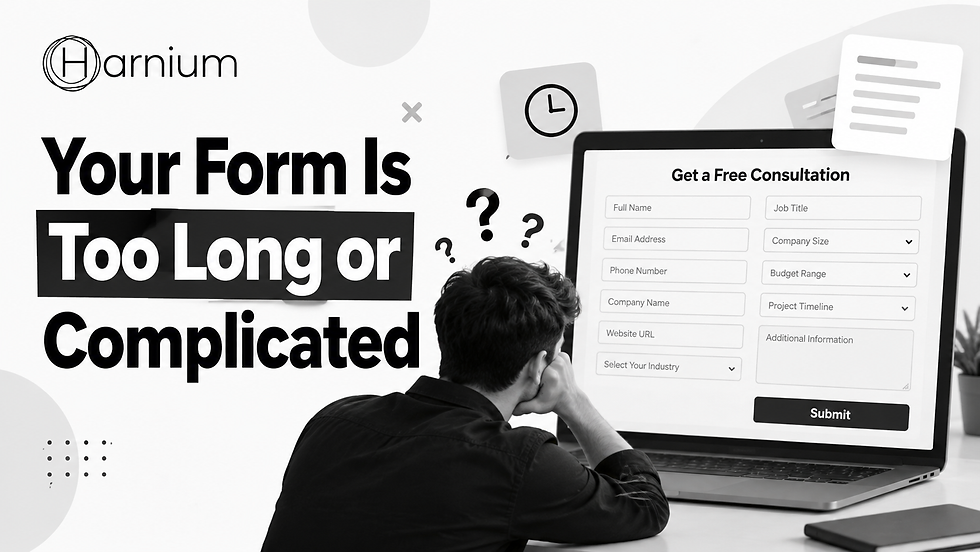
Your Form Is Too Long or Complicated
Getting someone interested in your service is one thing. Getting them to fill out a form and actually contact you is another.
Forms play an important role in lead generation, but they can also become a reason why potential customers leave your landing page without taking action.
Imagine someone visits your website, likes your services, and decides to click on "Request a Quote."
They are ready to connect with your business.
But instead of seeing a simple contact form, they find a long list of questions asking for their full name, email address, phone number, company details, job title, annual revenue, budget, industry, website URL, and much more.
At this point, they might think, "Do I really need to fill out all this information just to get a quote?"
And rather than spending several minutes completing the form, they may simply close the page.
This is one of those Landing Page Mistakes that can cost businesses valuable leads without them even realizing it.
The easier you make it for people to contact you, the more likely they are to complete the process.
For most service-based businesses, a simple form asking for a few basic details is often enough:
Full Name
Email Address
Phone Number
Brief Description of Their Requirement
You can always ask for additional information later during a phone call, email conversation, or consultation.
However, this doesn't mean every form needs to be extremely short.
It really depends on what you're offering.
For example, someone interested in a high-value business service may be comfortable answering a few extra questions. But if you're offering a free ebook or downloadable guide, asking for ten or twelve details can feel unnecessary.
The key is to make sure the effort required to complete the form matches the value visitors expect to receive.
Another thing businesses often overlook is how their forms work on mobile devices.
A form might look perfectly fine on a desktop but become frustrating to use on a smartphone.
Before publishing your landing page, open it on your own phone and try filling out the form like a real customer.
Check whether the fields are easy to select, the keyboard works properly, the submit button is visible, and error messages appear only when necessary.
Also, make sure visitors don't lose all their information if they accidentally miss a required field.
These may seem like small details, but they can make a big difference in the overall user experience.
At the end of the day, your form should make it easier for interested visitors to become leads, not give them another reason to leave.
Keep it simple, ask only what matters, and remove anything that makes the process unnecessarily complicated.

How Slow Loading Speed and Poor Design Drive Visitors Away from Your Landing Page?
You might have the best offer, an attractive headline, and a service that people genuinely need. But if your landing page takes too long to load or is difficult to use, visitors may leave before they even get a chance to understand what you're offering.
Think about the last time you opened a website that took forever to load. Did you wait patiently, or did you close it and look for another option?
Most people don't like waiting, especially when they have plenty of other choices available.
This is why page speed and user experience are so important for landing page conversions.
A common mistake businesses make is adding too many elements to make their landing pages look attractive. Large images, background videos, animations, and unnecessary features might look impressive, but they can also slow down the website.
Some common reasons why landing pages load slowly include:
Large images that haven't been optimized
Too many scripts running in the background
Heavy animations and visual effects
Unnecessary WordPress plugins
Slow or unreliable website hosting
Videos that play automatically
Too many tracking tools and third-party integrations
You don't need to remove every image or animation from your landing page. Just make sure everything you include serves a purpose.
For example, if a large background video isn't helping visitors understand your offer, is it really worth slowing down the page?
Sometimes, a simple image with a clear message can do a much better job.
Another important thing to consider is mobile responsiveness.
A lot of people discover businesses through Google Ads, social media, and search results on their phones.
If your landing page looks great on a laptop but becomes difficult to use on a smartphone, you could be losing potential customers.
Before launching your landing page, open it on different mobile devices and check a few basic things:
Can visitors easily tap the buttons?
Is the text readable without zooming in?
Are the contact forms easy to complete?
Do images and other elements fit properly on the screen?
Can people quickly understand your main offer?
Is the call-to-action button easy to find?
You should also pay attention to the overall design.
Some businesses assume that adding more colors, animations, graphics, and sections will make their landing pages more impressive.
But that's not always the case.
A crowded page can make it difficult for visitors to focus on the information that actually matters.
A clean, simple design often creates a better experience than a page filled with unnecessary visual effects.
Use enough white space so your content doesn't feel crowded. Choose fonts that are easy to read, keep paragraphs short, and organize information into clear sections.
If you have a lot of information to share, break it into smaller parts so visitors can quickly find what they're looking for.
Remember, people visit your landing page because they're interested in something you offer, not because they want to explore a complicated website design.
Your job is to make their experience as smooth as possible.
When your landing page loads quickly, looks professional, and works well on mobile devices, visitors can focus on your message instead of struggling with the website.
And when people can easily understand your offer and take the next step, you have a better chance of turning those visitors into valuable leads and customers.

You Are Not Giving Visitors Enough Reasons to Trust You
Think about the last time you visited a website for the first time and considered buying something or booking a service. Before making a decision, you probably wanted to know whether the company was genuine and if you could trust them.
Your potential customers think the same way.
Even if your landing page has an attractive offer and a clear message, visitors may hesitate to fill out a form or contact your business if they don't feel confident about it.
This becomes even more important when you're offering expensive services, where customers need to feel sure before spending their money.
Someone visiting your landing page might have questions like:
Is this company reliable?
Have they worked with other customers successfully?
Will someone actually contact me after I submit the form?
Can they deliver the results they're promising?
What makes this business worth choosing?
If your landing page doesn't answer these questions, you might lose potential customers who were genuinely interested in your services.
That's why building trust is just as important as explaining your offer.
One of the easiest ways to build trust is by showing visitors that other people have already had positive experiences with your business.
Here are a few ways to do that naturally.
Share Real Customer Testimonials
People often trust the experiences of other customers more than what a company says about itself.
But not every testimonial creates the same impact.
For example, a review saying "Excellent service!" sounds positive, but it doesn't tell potential customers much.
A more helpful testimonial explains what the customer was struggling with, what service they received, and how the experience helped them.
Real stories make it easier for new visitors to imagine what working with your business could be like.
Show Results Through Case Studies
If your company has helped clients achieve meaningful results, why not share those experiences?
For example, a digital marketing agency could publish a case study titled:
"How We Reduced Cost Per Lead by 35% for a Local Service Business."
When supported by real campaign data, this type of example helps visitors understand what your business is capable of.
You don't need to share every detail. A simple explanation of the challenge, your approach, and the results can be enough to build confidence.
Highlight Customer Reviews and Client Experience
If your business has positive reviews on Google or other trusted platforms, consider displaying a few genuine ones on your landing page.
You can also showcase the logos of companies you've worked with, as long as you have permission to use them.
Similarly, relevant certifications, professional experience, and industry achievements can help visitors feel more comfortable choosing your services.
However, trust isn't built through testimonials and achievements alone.
Sometimes, it's the smallest details that make the biggest difference.
Imagine finding a company that claims to be professional, but its landing page has spelling mistakes, broken images, outdated information, and no clear contact details.
Would you feel comfortable sharing your personal information with them?
Probably not.
Make sure visitors can easily find your business contact details and that every important section of your landing page works properly.
Another thing to avoid is making promises that sound too good to be true.
Statements like "Guaranteed 10X Growth in Just 7 Days" might grab attention, but they can also make people question whether your business is being realistic.
Instead of making exaggerated claims, focus on explaining what you actually offer, how your process works, and what customers can reasonably expect.
Remember, a trustworthy landing page doesn't need to convince people with big promises. It should give them enough genuine information to feel confident about taking the next step.
When visitors see real experiences, credible results, and honest communication, they are more likely to trust your business and become potential customers.

How Weak CTAs, Unclear Offers, and Poor Tracking Hurt Landing Page Conversions?
You've created a landing page, added useful information, and explained your services. Visitors are coming to your website, but there's still one problem: they're not taking action.
This is where many businesses struggle.
Sometimes, the problem isn't your product or service. It could be something as simple as an unclear button, an offer that doesn't feel valuable enough, or a lack of proper conversion tracking.
These small issues might not seem important, but they can make a big difference in how many visitors actually become customers.
Make Your Call to Action Clear and Relevant
Think about the last time you saw a button that simply said "Submit" or "Click Here."
Did it clearly tell you what would happen next?
Probably not.
Your call to action (CTA) should give visitors a clear reason to click.
Instead of using generic buttons, try something more specific, such as:
Book My Free Consultation
Request a Custom Quote
Get My Website Audit
Start My Free Trial
These buttons work better because they explain what visitors can expect after clicking.
But choosing the right words is only part of the process.
You also need to place your CTA where visitors can easily find it.
Imagine someone reading your landing page and deciding they're interested in your service. They want to contact you, but the only button is at the very bottom of the page.
Now they have to scroll all the way down just to take action.
Some visitors might do that, but others may simply leave.
A better approach is to include your main CTA at natural points throughout the landing page.
For example, you could place one near the top, another after explaining your service benefits, and one more after customer testimonials.
The goal isn't to fill your page with buttons. It's to make the next step easy whenever someone feels ready to take it.
Give Visitors a Reason to Take Action
Even with a clear CTA, people may not convert if your offer doesn't feel useful or valuable.
Ask yourself a simple question:
Why should someone contact my business today instead of continuing their search?
Your landing page should give them a convincing answer.
For example, if you run a digital marketing agency, you could offer a free initial consultation, a basic website audit, a strategy discussion, or a customized quote.
These offers give potential customers an opportunity to understand how your services might help before making a bigger commitment.
You don't necessarily need to offer discounts or free services to everyone.
Sometimes, simply explaining your process, showing what customers will receive, and making the next step feel easy can encourage more people to contact you.
The important thing is to make your offer relevant to what your audience actually needs.
Create Landing Pages That Match Your Campaigns
Another mistake businesses make is sending all their advertising traffic to the same landing page.
Imagine two people searching on Google.
One searches for "Google Ads Management Services," while the other searches for "Local SEO Services."
Both are looking for digital marketing support, but their requirements are different.
If you send both visitors to a general digital marketing landing page, they may have to spend extra time finding the information they need.
Instead, create dedicated landing pages for your important services.
Someone searching for Google Ads management should arrive on a page that discusses Google Ads, campaign management, advertising performance, and lead generation.
Similarly, someone interested in Local SEO should see information about local search visibility, Google Business Profile optimization, and attracting customers in their area.
When your advertisement and landing page communicate the same message, visitors can quickly understand that they've reached the right place.
This creates a smoother experience and can improve your chances of converting interested visitors into leads.
Track What Visitors Actually Do
Getting traffic to your landing page is important, but traffic alone doesn't tell you whether your marketing is successful.
Imagine spending money on Google Ads every month without knowing how many people are actually contacting your business.
You might see hundreds or thousands of visitors in your analytics dashboard, but that doesn't necessarily mean your campaigns are generating results.
This is why conversion tracking is essential.
Depending on your business goals, you should measure important actions such as:
Contact form submissions
Phone call enquiries
WhatsApp button clicks
Consultation bookings
Product purchases
Free trial registrations
Quote requests
Tools like Google Analytics 4 and Google Ads conversion tracking can help you understand which campaigns and landing pages are generating meaningful actions when configured correctly.
Once you have this information, you can make better decisions about where to spend your marketing budget.
For example, suppose you have two landing pages.
Landing Page A
1%
Conversion rate
5,000 visitors
50 leads
Landing Page B
4%
Conversion rate
2,000 visitors
80 leads
Even though Landing Page A receives more traffic, Landing Page B generates more leads.
That's why focusing only on visitor numbers can be misleading.
You also need to understand how many visitors are taking the actions that matter to your business.
Keep Testing and Improving Your Landing Page
One thing businesses should understand is that landing page optimization isn't a one-time task.
Even if your page is performing well today, there may still be opportunities to improve it.
Try experimenting with different headlines, CTA buttons, form lengths, testimonials, images, offers, and page layouts.
For example, you might test whether "Get a Free Consultation" generates more enquiries than "Talk to Our Experts."
Or you could compare a contact form with four fields against one with seven fields.
The important thing is to test changes carefully.
Don't redesign your entire landing page every time you want to improve conversions.
If you change the headline, form, images, and CTA all at once, it becomes difficult to understand what caused the improvement.
Instead, test focused changes, compare the results, and use the data to decide what works best. Where practical, run controlled A/B tests rather than relying only on before-and-after comparisons.
Over time, these improvements can help you create a landing page that delivers better results from your existing marketing efforts.
Final Thoughts: Small Landing Page Improvements Can Make a Big Difference
Creating a successful landing page isn't just about making something that looks attractive.
It's about understanding what visitors need, answering their questions, building trust, and making it easy for them to take the next step.
You could have an excellent Google Ads campaign, target the right keywords, and attract thousands of visitors every month. But if your landing page is confusing or difficult to use, many of those potential customers may leave without contacting you.
That's why it's important to review the common Landing Page Mistakes that can affect conversions.
These include unclear headlines, weak messaging, too many distractions, complicated contact forms, slow loading speeds, poor mobile design, missing trust signals, ineffective CTAs, unconvincing offers, and improper conversion tracking.
The good news is that you don't have to fix everything at once.
Start by looking at your landing page from a customer's perspective.
Imagine you're visiting the website for the first time.
Can you immediately understand what the business offers? Are the benefits clear? Does the company look trustworthy? Can you easily find the contact button? Is the form simple to complete?
Most importantly, does the page work smoothly on your phone?
If something feels confusing or difficult, there's a good chance your visitors might be experiencing the same problem.
Sometimes, improving your landing page can generate more leads without increasing your advertising budget.
For example, imagine your landing page receives 10,000 visitors every month.
Potential conversions from the same 10,000 visitors
At 1% conversion
100
At 2% conversion
200
Illustrative example: doubling the conversion rate doubles conversions at the same traffic volume.
That's an additional 100 conversions from the same number of visitors, assuming traffic quality stays comparable.
Of course, improving conversion rates takes testing, research, and continuous optimization. But the opportunity is worth exploring.
At Harnium, we believe successful digital marketing is not just about attracting visitors to a website. It's also about creating an experience that helps those visitors understand the offer, trust the business, and feel confident enough to take action.
Whether you're investing in SEO, Google Ads, or other digital marketing campaigns, your landing page plays an important role in turning traffic into business opportunities.
Focus on clear messaging, simple design, relevant offers, genuine customer trust, and accurate conversion tracking.
Because at the end of the day, a great landing page doesn't just attract attention. It helps turn genuine interest into meaningful business results.


Comments